


Afreeca TV brand identity renewal
Afreeca TV is a representative Internet broadcasting platform in Korea that opened the era of single-person media in earnest, starting with the service in 2006. Afreeca TV has long been the No. 1 service in Korea by establishing its own community ecosystem, but as it developed and grew based on sales and growth, it lacked some consistency in its own language and image to represent the brand. In addition, due to the lack of a clear brand identity unique to Afreeca TV, the image of popular BJs was recognized as the image of Afreeca TV, and users were not feeling the clear value of Afreeca TV. Therefore, in order to build a brand identity unique to African TV, the goal is to build a unique image of African TV based on existing identity. We have renewed our company to express African TV's unique identity at various brand contacts such as logos, key visuals, colors, and fonts that meet customers.
Afreeca TV is a continent where people of various personalities gather to form their own ecosystem. Viewers, BJs and internal members of Afreeca TV are all on a journey to find good content. In addition, we continue to explore joy in order to grow together in harmony with each other's individuality and expertise. Realize the value of "exploring and discovering" through brand experiences created by viewers and BJs who experience the brand.
We defined the freedom and unique design principles of Afreeca TV and applied them to brand logos, typography, and key visuals.


Project Approach
To establish a clear brand identity for Afreeca TV, we identified the functional/emotional value that Afreeca TV provided before. Based on functional/emotional features, we have accumulated the brand essence and core value of Afreeca TV.
아프리카 TV의 명확한 브랜드 정체성을 구축하고자 이전까지 아프리카 TV가 제공했던 기능적 / 정서적 가치를
파악하였습니다. 기능적/정서적 특징을 기반으로 아프리카 TV의 브랜드 본질과 핵심가치를 적립하였습니다.
파악하였습니다. 기능적/정서적 특징을 기반으로 아프리카 TV의 브랜드 본질과 핵심가치를 적립하였습니다.
Brand Essence
Afreeca TV is a continent where people of various personalities gather to form their own ecosystem. Viewers, BJs and internal members of Afreeca TV are all on a journey to find good content. In addition, we continue to explore joy in order to grow together in harmony with each other's individuality and expertise. We want to realize the value of "exploring and discovering" through brand experiences created by viewers and BJs who experience the brand.
아프리카TV는 다양한 개성을 가진 사람들이 모여 고유의 생태계를 이루고 있는 대륙입니다. 아프리카티비를 아우르고 있는 시청자와 BJ 그리고 내부구성원 모두 좋은 콘텐츠를 찾기 위한 여정을 떠납니다. 또 각자가 가진 개성과 전문성이 조화롭게 어우러져 함께 성장해 나가기 위해 ‘즐거움에 대한 탐험'을 끊임없이 지속합니다. 브랜드를 경험하는시청자와 BJ가 함께 만들어가는 브랜드 경험을 통해 ‘탐험하고 발견하는’의 가치를 실현시키고자 합니다.
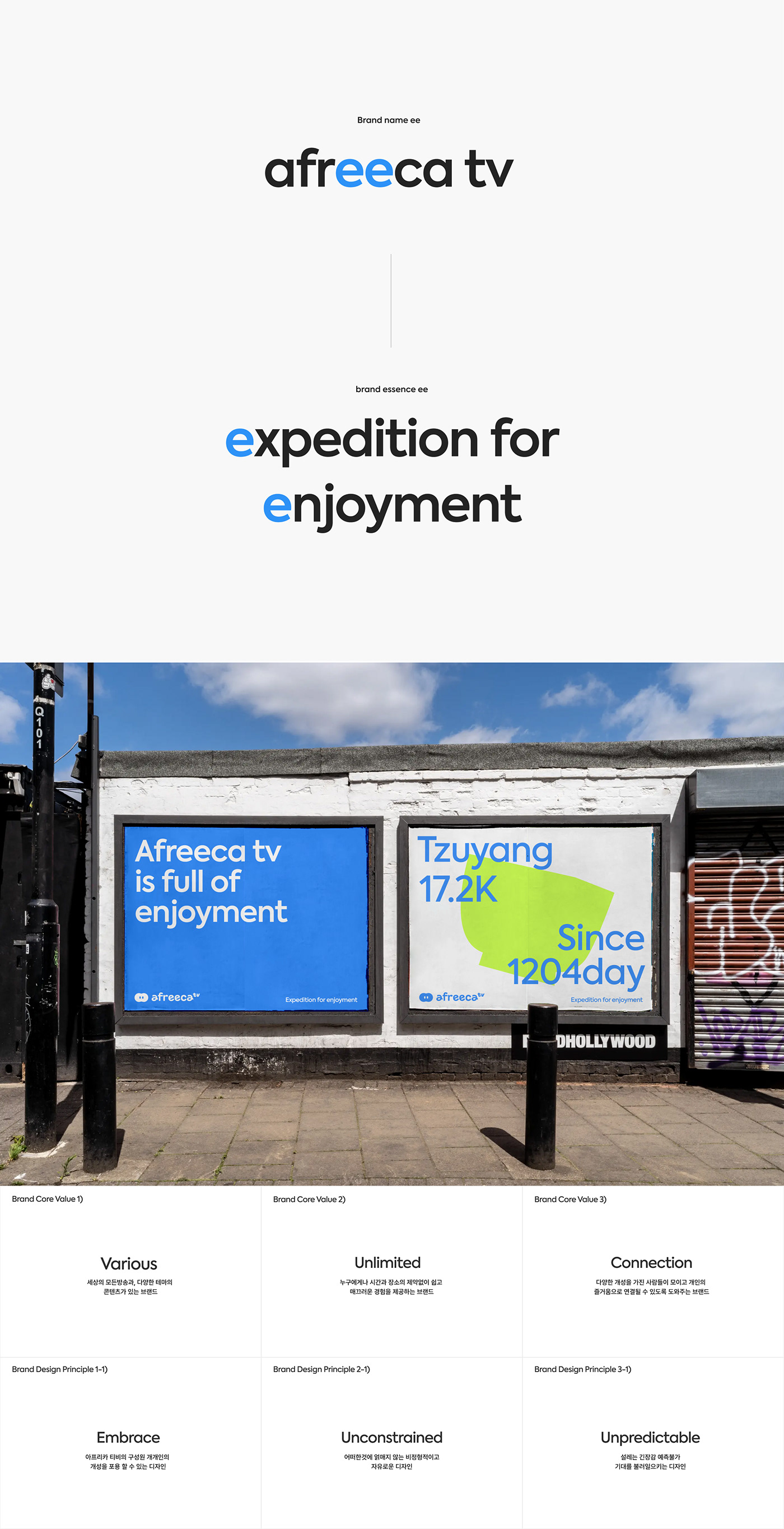
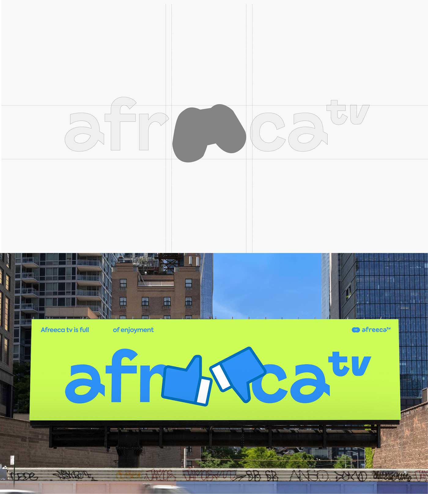
Brand Logo
Afreeca TV's brand symbol logo is derived from its brand essence, "expedition for enjoyment," and is made with a motif of telescopes, a tool for exploration and discovery. The telescope logo is used as a tool to help Afreeca TV viewers, BJs, and internal members explore. The type logo is produced in a flowy curve and characteristic form, symbolizing freedom with the diversity and overflowing talent and personality of Afreeca TV members.
아프리카TV의 브랜드 심볼 로고는 브랜드 본질인 "즐거움을 위한 탐험"에서 파생 되었으며 탐험과 발견의 도구인 망원경을 모티프로 제작되었습니다. 망원경 로고는 아프리카TV 아우르고 있는 시청자와 BJ, 내부 구성원들의 탐험을 도와주는 도구로 사용됩니다. 타입 로고는 유려한 곡선과 개성넘치는 형태로 제작되어 아프리카 TV 구성원들의다양성과 넘치는 끼와 개성을 더불어 자유로움을 상징합니다.

Expedition identity
The spelling 'ee' of Afreeca TV implies the meaning of expedtion for enjoyment, the brand essence. The spelling 'ee' stands for a telescope that will help you explore. The area of 'ee' refers to a space for exploring content. I visualized exploring various contents through symbol logos and key visuals.
아프리카 티비의 철자 ‘ee’는 브랜드 에센스인 expedtion for enjoyment 의미를 함축하고 있습니다. 철자 ‘ee’는
탐험을 도와줄 망원경을 상징힙니다. ‘ee’ 의 영역은 콘텐츠를 탐험하는 공간을 의미하며 심볼 로고와 키비주얼 등 다양한 콘텐츠의 가치와 자유로움 등의 가치가 담기는것을 시각화했습니다.
Brand Color
Afreeca TV's color inherits and enhances the existing color. The new color maintains brand awareness while adjusting tone and mood to form a dynamic look and feel. Each brand color was actively used for various brand communication contacts.
아프리카TV의 컬러는 기존 컬러를 계승하고 개선하여 사용합니다. 새로운 컬러는 브랜드 인지도를 유지함과 동시에 톤앤무드를 조정하여 다이나믹한 룩앤필을 형성합니다. 각각의 브랜드 컬러들은 적극적으로 다양한 브랜드 커뮤니케이션 접점 전반에 사용하였습니다.

Brand Typography
The typography of "Afreeca TV" has been selected as a functional and reasonable typeface that can be adapted well in various media and environments. It uses the highly readable "Pretendard" typeface, and uses the "Axiforma" typeface that can express the brand-oriented image well and goes well with the Korean typeface.
아프리카의 타이포그래피는 다양한 매체와 환경에서도 잘 적응 할 수 있는 기능적이고 합리적은 서체로 선정하였습니다. 가독성이 뛰어난 Pretendard 서체를 사용하고 영문 서체는 브랜드의 지향 이미지를 잘 표현하며 국문 서체와 잘 어울리는 'Axiforma' 서체를 사용합니다.

Brand Keyvisual
The various genres and contents of 'Afreeca TV' are the core values of African TV. Therefore, I expressed the continent representing various fields and contents with key visuals. Each continent represents games, mukbang, creation, daily life, music, sports, variety, and e-spots. Key visuals are used at various points of contact with logos, signage, and web users, adding brand consistency.
아프리카TV의 다양한 장르와 콘텐츠는 아프리카TV의 핵심가치입니다. 이에 다양한 분야과 콘텐츠를 나타내는 대륙을 키비주얼로 표현했습니다. 각 대륙은 게임, 먹방, 창작, 일상, 음악, 스포츠, 버라이어티 ,e-sprots를 나타냅니다. 키비주얼은 로고, 사이니지, 웹 유저와 만나는 다양한 접점에서 사용되며 브랜드의 일관성을 더합니다.


